This was the earliest website homepage for GMI that I'm aware of - from 2002:
 This was the homepage from 2003:
This was the homepage for 2005:
This was my redesign/realign of the homepage in 2007:
Quite the progression, I must say.
This was the homepage from 2003:
This was the homepage for 2005:
This was my redesign/realign of the homepage in 2007:
Quite the progression, I must say.

And here is my redesign/realign of the website:
 (Design created: 2007)
 'Voice your opinion': Although GlobalTestMarket pays you to take online surveys, it's not all about the money. This banner was created to capture the audience that wasn't in it for the dough, but instead out to have their voice heard.
 'Eye Exam': Another method to get the attention of web traffic, this time in the form of a scrambled eye exam, that soon becomes unscrambled.
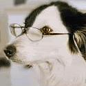
 'We all like rewards': These 2 banners take a different path, playing with the fact that surveys are for everyone, and everyone likes getting rewarded. The dog in the image, upon bringing the newspaper, will most likely receive a treat, or at the least, a nice pat on the head.
 'All about U': A spin off of the above eye exam banner, but this time the eye exam is an easy one: Everything is a U. This was 'U'sed to help illustrate that online surveys are easy.
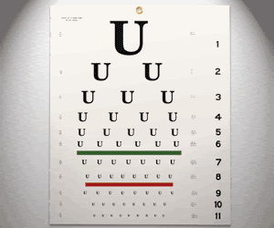 'Earn cash': Tried to incorporate some real people in photographs, with a main message of earning cash.
 'Vacancy': The idea behind this banner was to portray a Vacancy sign at a motel, to help reiterate that there is still an opportunity to earn money taking online surveys.
 New design (FilmJabber.com):
 Quick plug: Erik and his entertaining (and sometimes explicit) movie reviews can be read at Film Jabber: http://www.filmjabber.com
![]()
![]() (Designs created: 2004)
(Designs created: 2004)


I point the earlier version out only to offer a comparison. Here is the site I built for Justin:
At the time I created this site design, Justin was just beginning to make a dent in the industry and was just beginning to get his name out there. I therefore wanted to incorporate a 'Starving Artist' theme, and this was my reasoning behind the crinkled-up paper, cardboard, tape, etc. I also thought it gave him a sense of mystery and underground, too. And the spotlight you see within the design was just that, a spotlight... used to signify that although he was a 'starving artist' in many ways, he was on the verge of making a breakthrough. (Design created: 2004)
A couple quick plugs for Justin:
Justin is a great musician and I've really come to enjoy listening to his creations. He's also a great friend and incredibly gifted individual. Check out Justin's new site design (very nice!): http://www.justinklump.com. Also check out Justin on MySpace (http://www.myspace.com/justinklump) - listen to a few of his tracks and I think you'll be hooked!


 If you got your hands on the Boyd Massie Rookie Card, I'm afraid it's Beckett value hasn't gone up too much over the years :) If you are wondering about my site, I don't maintain http://www.bnmdesign.net anymore - sorry.
 #2 of 3 - TERM'OIL': Things start getting a little more interesting now, as I present some controversial facts surrounding the idea that the war in Iraq is/isn't not a "war over oil".
 #3 of 3 - B'OIL'ING POINT.: Projections of our use of oil in the future produce some scary numbers.

You will notice that as the posters progress, the hand (which once started out as a clean and nearly perfect print) smears more and more until in poster #3 there lacks any resemblance of a hand. Look closely in poster #2...you will even see some evil faces (in the left and right palm), which surprisingly wasn't manipulated manually by me. It was just how the filter operated, but I think it's a nice touch, despite how evil it looks.
All handprints and oil production was done by yours truly! I had a fun time smearing oil on my hands and making prints on paper. It reminded me of finger painting in grade school, for sure! After much experimentation, I then photographed the prints and then manipulated everything digitally after that point.
(Designs created: 2005)


 As a group, we decided that each member had incorporated great pieces to the overall puzzle we would call our final logo. We all wanted some sort of flame within the logo. We also soon discovered that the charred looking text, or branded text was very appealing and great indicator of barbecue.
 In addition to the logo, we had to also create some collateral: A teaser advertisement that would fold and stand on the tables in the food court, and a children's hat (like the BK king hat). Here's a look at both:
 (Designs created: 2004)
 This was one of my favorite creations. Two separate photos created to become one. A gigantic Mt. Rainier waterfall used in conjunction with my own tormented face. My face was applied to a layer above the waterfall picture, and then a simple opacity reduction was applied, so the two separate features would blend. And blend they did. I think this picture worked out so beautifully and easily, and I think that's why it's one of my favorites I've ever done. Everyone feels enormous frustration at times, or wants to cry out with foolish anger from time to time - and I think this image is my release of those emotions - or what it would look like if I did.

 The next step as a group was to create a billboard, or print advertisement:
 (Design created: 2004)
#2 - Played with some color change, but the blue just didn't do it for me --- pulse reminded me too much of blood flow, and so I had to stick with the red - plus red is a color that has a lot more pop to it. I think the blue just made it look dead, literally.

#3 - Stuck with the 'echo' lines like the above example, but intensified them a bit. Switched color back from blue to red. Added italics to 'Motion' within tagline.

#4 - Reduced the 'echo' lines to just the left-hand side of the logo - I think it creates a much stronger visual presence because of the fact it's not symmetrical. I liked how the 'echo' lines connected to the word 'Pulse': Gave the logo a sense of flow.

#5 - Not sure why I went away from what was working before, but I think I lost my way a bit here - see #6 below for my redemption period. 
#6 - I incorporated all the features I liked from previous versions to help lead me to a logo that was very simple, but visual stimulating and powerful.

Did our group choose 'Pulse' as the energy drink of choice? (Design created: 2004)
