This was the earliest website homepage for GMI that I'm aware of - from 2002:
 This was the homepage from 2003:
This was the homepage for 2005:
This was my redesign/realign of the homepage in 2007:
Quite the progression, I must say.
This was the homepage from 2003:
This was the homepage for 2005:
This was my redesign/realign of the homepage in 2007:
Quite the progression, I must say.

And here is my redesign/realign of the website:
 (Design created: 2007)
 'Voice your opinion': Although GlobalTestMarket pays you to take online surveys, it's not all about the money. This banner was created to capture the audience that wasn't in it for the dough, but instead out to have their voice heard.
 'Eye Exam': Another method to get the attention of web traffic, this time in the form of a scrambled eye exam, that soon becomes unscrambled.
 'We all like rewards': These 2 banners take a different path, playing with the fact that surveys are for everyone, and everyone likes getting rewarded. The dog in the image, upon bringing the newspaper, will most likely receive a treat, or at the least, a nice pat on the head.
 'All about U': A spin off of the above eye exam banner, but this time the eye exam is an easy one: Everything is a U. This was 'U'sed to help illustrate that online surveys are easy.
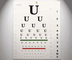 'Earn cash': Tried to incorporate some real people in photographs, with a main message of earning cash.
 'Vacancy': The idea behind this banner was to portray a Vacancy sign at a motel, to help reiterate that there is still an opportunity to earn money taking online surveys.
 New design (FilmJabber.com):
 Quick plug: Erik and his entertaining (and sometimes explicit) movie reviews can be read at Film Jabber: http://www.filmjabber.com
![]()
![]() (Designs created: 2004)
(Designs created: 2004)


I point the earlier version out only to offer a comparison. Here is the site I built for Justin:
At the time I created this site design, Justin was just beginning to make a dent in the industry and was just beginning to get his name out there. I therefore wanted to incorporate a 'Starving Artist' theme, and this was my reasoning behind the crinkled-up paper, cardboard, tape, etc. I also thought it gave him a sense of mystery and underground, too. And the spotlight you see within the design was just that, a spotlight... used to signify that although he was a 'starving artist' in many ways, he was on the verge of making a breakthrough. (Design created: 2004)
A couple quick plugs for Justin:
Justin is a great musician and I've really come to enjoy listening to his creations. He's also a great friend and incredibly gifted individual. Check out Justin's new site design (very nice!): http://www.justinklump.com. Also check out Justin on MySpace (http://www.myspace.com/justinklump) - listen to a few of his tracks and I think you'll be hooked!


